
Help Picking a Print to Make!
So, I have 4 preliminary designs I sketches and worked up on the computer. I'd love everyone's opinions on which one I should ultimately do. There's only time to do the one; and I'm having a terribly time picking!!! What do you think? 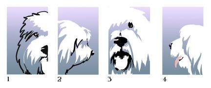 |
|
|
| I love #3 - the whole face just invites you right in! |
| I voted 3 as well, but I really like 2, more subtle, but I think it would really be nice. |
| I voted 3 too. I voted the one that caught my eye the first. I also feel if you decide to paint the tongue pink it would look really great. |
| 3!! |
| I voted for 3--first choice. I like #1 too! |
| #1! |
| Oh wow! #3 is a more typical sheepdog artist rendering. I see it with many artists. It does capture the sheepdog mood and gives depth, which is curious with a block print. #1 is a bit more ethereal #4 is a fun shaggy face, I like there isn't the black line to define the dog #2 ...and to be completely contrary, I like the black line here, the ear definition but less on the rest of the dog, but realize something has to define the object. So I guess #3 |
| I voted 3. There seems be more expression, I think it's the eye. |
| My first impulse was 3, but I like #1 almost as much. What are you planning to do with the image? Just curious, you are so creative. They are perfect for so many things. |
SheepieBoss wrote: Oh wow! #3 is a more typical sheepdog artist rendering. I see it with many artists. It does capture the sheepdog mood and gives depth, which is curious with a block print. #1 is a bit more ethereal #4 is a fun shaggy face, I like there isn't the black line to define the dog #2 ...and to be completely contrary, I like the black line here, the ear definition but less on the rest of the dog, but realize something has to define the object. So I guess #3 Yeah I'll agree with Susan, #3 is the most "cliché" of the 4, and with good reason. But partly because of that, I'm leaning towards #2, I think it would actually stand out more by not being the typical sheepdog pose. |
auntybren wrote: My first impulse was 3, but I like #1 almost as much. What are you planning to do with the image? Just curious, you are so creative. They are perfect for so many things. We will get to make a block print, I think on greeting card stock. Once we make the prints, I'll retain the linoleum blocks. So I guess I could continue to print them. I took printmaking in college, and really liked it. If this is as much fun as I remember, I may invest in some tools and maybe do some of the other designs. If I tweek number one, it's meant to be a counter-part to three. One is Tonks and Three is Luna. But there's something about the simplicity of 4 I really like. Also, I keep thinking there's got to be a way to turn the images into a pattern for fabric.  |
I too voted for#3. To me it represents the typical happy sheepie with the tongue out.  By the way, what are you going to make with the block print? By the way, what are you going to make with the block print?  Nancy |
| here is the website of the artist that is hosting the workshop, Laura Wilder: http://www.laurawilder.com/Store.html if you scroll all the way to the bottom, there are some gorgeous dog breed pieces. |
Greeting cards would be awesome of your girls!! Stamps to match  Whatever you do, we will be interested to see it  |
| I like 3 the best, mostly based on type for being a "good OES". I like the premise of #2 artistically, but the stop is not well defined and the nose is snipey. If you fixed those parts, I would vote for #2. |
 I thought I was being woosie liking #4 for the gentle sheepieness in it. I thought I was being woosie liking #4 for the gentle sheepieness in it. I mentioned I've seen work similar to #3, which I still like, but just for a perspective: http://stashadesigns.com/prettypicture.html |
| I like #3 best but would like #4 if there the dog filled the frame more. Have to agree with Dawn on #2, the dog has virtually no chin. If that was modified it would be very nice too. |
| I like 3 and 4 because they don't have the black lines. Dawn you crack me up. It's great that your 'show eye' comes into play. And at least its not kennel blindness. |
| Allison, thought this might be helpful. http://www.quiltmaker.com/articles/21_t ... _to_fabric |
| I like #3 and #4. It would be nice to have cards with both of your girls. |
thanks! I have done fabric prints before, through Spoonflower.com. Sometimes it's about finding the right spot to create a repeat. I previously took my artwork: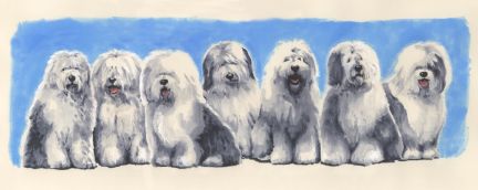 and made a couple of different repeating pattern fabrics:  I also tried taking art I did for a couple of banners from Nationals, and creating a repeating pattern from that:  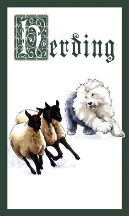 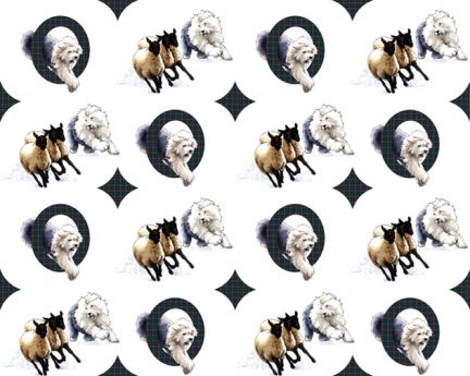 I think that the difficult part of making a repeating pattern from the block prints will be trying to get a good place to create the repeat. The harsh 90 degree edge of the square image, plus the color gradient, are going to make this a challenge. |
| I'm back!!! I had my block printing work shop back on the 20th and 21st of February, but we went from there almost straight to Minnesota, and I can't seem to post photos here from my phone. I'm sure it's a personal shortcoming. But now that I'm home, I wanted to post how my print turned out! I'm really very excited about it all!  So without further delay.... So without further delay....I wanted to first show some work by the artist who hosted the workshop. Her name is Laura Wilder and I recommend googling her and checking out her website. This first one is called Winter Woods; it's one of a pair of prints that Adam and I have in our living room. 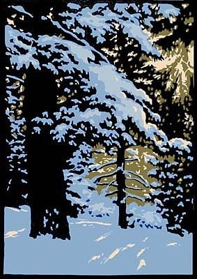 I became a fan of Laura's work years ago, when I encountered her many dog breed prints. Sadly, she has not yet done a sheepdog. Emphasis on yet. 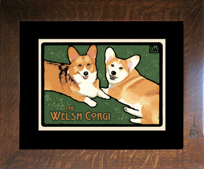  So now that you've seen the work of a REAL master craftsman, I'll go on to show you my humble attempts. To be honest, I'm quite pleased with the outcome! |
First step (after picking the design) was to carve the 2 linoleum blocks. You can see me carving the block for the gray to lavender gradient ink here: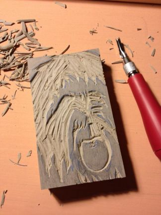 This next photo is both of my blocks carved, and my gray to lavender ink is ready to be rolled on:  The other block gets black ink, and helps to solidify details of the image; in this photo you can see both blocks inked, and the final printed card: 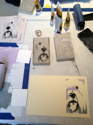 |
I ended up printing several cards, and using a pink marker to color the tongue. It's a bit of cheating, but I wasn't going to cut a third block just for that bit of pink: and the final product: 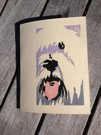 |
| That nailed it Allison!!!!!!!! |
Love it!  I wish I had a 1000th of the talent you have in your little finger. Laurie and Oscar |
| It turned out so wonderful. And seeing your instructor's work - I have seen prints of the dogs before. Very cool! |
Nice job. It is always nice to see how these things are made and the talent and effort needed  |
| Yes, great job! Laura is incredible, Love the snow scene! Defeats the wood carving theme but can you apply the color to the woodblock first?...thinking of the tongue. Almost makes me want to dress up Kdog with a spot of greyed violet |
SheepieBoss wrote: Defeats the wood carving theme but can you apply the color to the woodblock first?...thinking of the tongue. that was my original goal, actually. In Japanese woodblock printing, they often will hand paint a block for certain details like that. The problem was, I had the tongue on there, and I'd forget EVERY TIME to wipe the gray ink off. In the end, I carved it off the block so it would be a blank area that I could just color in with marker. |
| Very nice work Allison! Love it! |
| Lovely Alison. Seeing all your tools in those photos reminded me of the block printing work I did forever ago in High School. I won a prize at the local art show for my print. I loved using the roller and then seeing how the picture came out after. I think it was because the block is kind of bland and the color brings the work to life. |
| Mim- it reminded me of the sort of work I did in high school too. I took a print making course in college (one semester) but we did copper plate printing. This was so simple, with fairly basic and straightforward materials, that I think anyone could do it in their home, with a design that wasn't too complicated. |
| Those are great! |
| Beautiful Allison, you are so very talented. I hope that you have this work hanging somewhere at home also  |
auntybren wrote: Beautiful Allison, you are so very talented. I hope that you have this work hanging somewhere at home also I put it on a shelf in the kitchen; along with some other sheepie stuff. So it's sort of hanging...? |
| So very cool. I am so fascinated by art. I think because I am particularly inept at it, it makes me appreciate, all the more, the talent it takes to create it. To make sure I understand the process, Allison, you had to carve a different block for each color or combination of colors? The blocks themselves were slightly different depending on what you wanted to show up? |
| Exactly right! I had the black lines and nose; so that was one block. The lavender/gray was another block. I could have done the pink tongue on a third block, and instead cheated and colored it by hand. It's mind blowing when you look at some of the more detailed block prints, and realize how many blocks they had to carve!!! there's a cool video on YouTube showing it being done. the demonstrator was smart; if her blocks are out of alignment, it won't matter. In images like mine, if the blocks didn't like up, it looked a bit of a mess. http://www.youtube.com/watch?v=a-L4gTmX8JQ We've begun collecting block print artwork in the last few years. I have my eye on one right now that's quite lovely. I was told that on many Japanese block prints, rather than have a block for each color, sometimes they would paint multiple colors on a single block. That makes sense when you see the detail in the tiny flowers in this field. 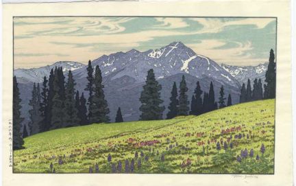 this print is of Holy Cross in Vail, Colorado. It was made in 1966 by Toshi Yoshida and I really, really want it. It's a bit expensive for art I can't see in person- it's in an online gallery. But I might have to take a leap on it, and hope for the best. |
| actually, I found a blog where Laura Wilder shows her print from beginning to end; pretty cool! http://laurawilderartwork.blogspot.com and here's a page with Step by Step on one of her simpler designs: http://www.laurawilder.com/Laura_Printmaking.html |
| Very nice, I like the tongue left white. Beautiful mountain print, I understand why you want it. |
| Ooooh I love that mountain print too! Think I'd be getting it even if I couldn't see it in person. |
Mim wrote: Ooooh I love that mountain print too! Think I'd be getting it even if I couldn't see it in person. See that's what I'm thinking. But it's over $400-- a lot to spend on something that I might get in hand and then not like. And I just splurged on a piece of old comic art featuring a sheepdog. I have to try and keep my splurges down, I think. Art is seriously my weakness. And sheepdogs. |
Darth Snuggle wrote: Mim wrote: Ooooh I love that mountain print too! Think I'd be getting it even if I couldn't see it in person. See that's what I'm thinking. But it's over $400-- a lot to spend on something that I might get in hand and then not like. And I just splurged on a piece of old comic art featuring a sheepdog. I have to try and keep my splurges down, I think. Art is seriously my weakness. And sheepdogs. Would it hold its value in terms of resale if it's not really what you want? You could hold on to it for a little while then resell. |
| That is beautiful, Allison. It is mind blowing to think each color represents a different block when you see all those details. Wow! I understand how it'd be tempting to purchase it - even only seeing it online. |
Didn't find exactly what you're looking for? Search again here:

Custom Search
|
|
| |
|
|
|
|
|